0 comments Wednesday, December 10, 2008

Well let's just get right to the good stuff:

View the final website

Changes made since the last post:

  • added CSS footer
  • main 'Critique' title is also a button that returns the flash to its original state
  • added helpful rollover descriptions on the 3 site rectangles
  • removed previous rollover fade effect
  • added sub-naviagtion elements for each site and color coded to match arrows
  • got rid of the snowflake icon next to navigation links and replaced with a chevron
  • each navigation link stays activated after being clicked so you can see the link chosen
  • added a 'view website' link with coordinating color scheme
  • added text content for each web site critique
  • made the website title a button that returns to the original open state
  • added a header at the top of the flash file
  • added the required windows&mirrors text into my css section
  • changed the fonts from eurostile to agency fb and univers
  • reworked the 'close' button to sit flush with the top of the content box
  • the colored arrows still allow you to skip to any website section
I believe that's it. I really enjoyed working through all the quirks and refining the details so that the user interaction was quite clear and helpful. I added the rollOver descriptions after I read a top 10 navigation post on some blog that showed the progression of navigation menu systems. One of the notable items it suggested is that people want to know more before they click; a la rollOver descriptions.

TOTALLY just remembered that I needed to post my site map, so here it is:

View site map

0 comments

Even though the previous critique illustrated that events occurring on mouse rollOvers was uncommon and unexpected I decided to make all the arrows rollOver to see the effect anyways:

View rollOvers!

0 comments Tuesday, December 9, 2008

I was browsing the Art 328 Blackboard site and saw that we have a required document to insert on our web site: "webContent.doc"

I am unsure how most of you feel but I think it is somewhat obtrusive to our site and our critique. I agree that the document is the supporting article that drives the reason for this critique lesson but I disagree about making it required to put on our site.

To me it's a challenge to figure out a way to integrate it and give it purpose without letting it stick out like a sore thumb; as just some block of content tagged onto the site. In a way it relates to some real world experiences I've had developing sites and the client insisting on certain pieces being on their site.

This document is quite long and not very concise. It has an elitist tone in how it states how design on the web should be. I believe it does a good job with the analogies to windows and mirrors but that's where it should stop in my opinion.

0 comments Monday, December 8, 2008

I received some great feedback on my last post and agreed with what was said. So I revised the interactivity and animation style to be more intuitive and effective with simpler animations. See for yourself:

View website

Now instead of the slanted rectangle painting out horizontally then vertically, it just grows in one motion. Instead of having this painting take effect on mouseOver it now occurs on mouseClick with an added lightening effect on mouseOver. I added in some text content below the flash piece to describe the purpose of the website and its design as it applies to the project goal. I felt this bit of information is always good to refer back so I did not give it its own section. That way it's always visible/accessible. I may add a footer at the very bottom that contains an e-mail link and other tertiary information.

2 comments Saturday, December 6, 2008

At this point I have all the main interactivity finished for guiding the user to the content. What I have left to do is insert the supporting content into each website's critique. Before I begin that process I would like to get some feedback on the current interactivity:

View website

Is it easy to navigate and are the navigational elements easy to find?

There is a combination of interactive styles on the main page: mouse-over events and mouse-click events. Do you feel this combination is good or should all the arrows always be mouse-overs or mouse-clicks?

Do you feel this site needs an 'About' section to explain the purpose or should that already be incorporated without a separate section?

Does the site design/interactivity compete with the content?

0 comments Wednesday, December 3, 2008

Today I began building my flash layout and implementing the navigation/interactivity:

View Website

0 comments Monday, December 1, 2008

Even though I will most likely be building my website in Flash; I have gone through the exercise of building a website in XHTML/CSS:

View website

AvidLip's website is another XHTML/CSS website using the mootools javascript framework I have developed recently:

View website

0 comments Friday, November 21, 2008


0 comments

I believe my 'critique' website should have these attributes:

  1. Neutral design that allows the content to be the main focus
  2. The design should use minimal graphics but rely on simple metaphors for navigation
  3. The user should be able to quickly use any part of the site
  4. The main section or home page should offer insight to the website's function and offer a point of departure that's easy to discover.
  5. The point of departure should involve some sort of glimpse of each of the 3 websites in review.
  6. Besides having a neutral and simple design, it still should engage interactivity and use trends that target our classroom demographic.
  7. Styles need to be set up to allow for discrete identification of headings, titles, subtitles, body copy, links, and quotes.
  8. A system of presenting screenshots needs to be established
  9. A synopsis or concluding statement should be available for each website critique so that if a user does not have the time to read the full review they can still walk away with the gist of the critique. Maybe an optional PDF download.
  10. Contact information
  11. Possibly a biographical page that gives an understanding of the background and why me, the author might be qualified to give such a website critique?
  12. The color palette should be quite homogeneous with a few contrasting colors for call to action areas and/or links
  13. The theme of the website should be set in a tone that uses real life situations posed as questions that many people are inclined to comment on or investigate - then to make an analog comparison to the website in review. This will divert from a dry website of purely informing the viewer of my findings. To take it a step further these questions and responses could be done in a dry humoristic tone.

0 comments

I will be using Flash to build my website that critiques bl:nd, DESIGNFLOOD and FOG OF WAR

In order to begin creating my 3 layouts that denote the look and feel, I will need to investigate more thoroughly best practices for such a site.

Looking at designflood.com I already see a version of how to do a similar site. They too are basically just a portal to see other sites and offer a quick way to rate them. What differs in my website is that I will not offer user ratings but instead provide feedback on the selected sites. I like their mission to have the website design remain neutral and let the featured websites take hierarchy. This should be a feature of my website so that the content is the main focus and not my design. What I don't like about their site is the lack of metaphors to help drive navigation and other user interactions. I want it to be clear what to click on and where you can go.

This site, graphic-design.com has a very simple straightforward layout and content arrangement for its critique on websites. The background is white and non intrusive, it's easy to find websites and see a short glimpse of their critique before diving into the full review. Unfortunately to see the full review it takes you to another site that is just a PHP bulletin board. I feel this site change is not fluid and frustrating.

When searching for more websites that critique other websites I found that most of them are all in a bulletin board format to allow for extreme user interactivity. I believe the intention of our website is not to create a forum but more so to create a website to showcase our findings. On that note I am going to change my search criteria to websites that showcase a minimal amount of information in a purely informational fashion.

CSStux
does a good job of this although it doesn't provide much feedback on the sites it has listed.

Smashingmagazine.com does a good job of breaking down elements with thorough reviews that have related screenshots to show in detail what the critique is about. I like this style of a linear story with pictures.

Sitecritic.com does the best job of showcasing websites then offering a thorough review with screenshots if you choose to dive in.

Killersites.com's website review section also has a fairly good system of showing their review but I think it doesn't look very pretty.

Commonsensemedia.com is different from the previous sites in that it reviews for a specific audience of concerned parents. This now makes me ask the question about if I should tailor my website critique to tailor a specific audience or style. I think if it did, the site would have more character since it's not just an unbiased critique. For instance I could make my website about how the 3 chosen websites work for a our student demographic and if the design relates well to our asthetic.

0 comments Wednesday, November 19, 2008

3 homepage directions (look and feel) with general examples of a few content elements in relation to the content we have from the website critique. Format should be between 700px - 1000px but all other format options are undefined.

Bring index cards to class for site mapping. Site map may or may not be due the following Wednesday.

Let Krista know by Friday at noon via e-mail if we are going to use Flash or HTML/CSS for this project.

December 1st is an in-class work day.

0 comments

ScreenShot:


Navigation:

Is it easy to navigate or difficult?
It's very easy to see what to click on but difficult to discern why to click or what clicking might do.

How are you led through the site?
You are led through the site with a date-based navigation after a video plays and shows a date coordinated video next.

What visual clues are given to tell you how to interact?
There are dates, small icons and areas of white that denote links.

Does the designer use a metaphors to get you to move through the website?
Yes.

What Kind of metaphors are used? Organizational Metaphors = (organized by type, kind etc…); Functional Metaphors = performs a “real world” function (in Photoshop you can figuratively “cut” and “paste”) or Visual Metaphors (common graphic elements familiar to most – the traditional “play”, “fast-forward”, “rewind” buttons found on CD players)
The designer uses icons that represent what the text next to it is describing. There are also more abstract buttons in the form of a play and pause button to control the videos and slide the date chooser around.

Information Architecture:
Does the information in the site make sense?
At first it doesn't because I don't understand why the dates are there; probably because I haven't seen the movie. After a lot of poking around and watching the trailer I understand why the information is there but it's not apparent at first.

Can you access the content you want easily?
Yes the content is all on one page and within very short distances to each other.

How is the content organized? (By location, alphabet, timeline, category, etc? )
The content is organized by date in the middle and then organized by suggested user relevance on the left of the circle.

Is there visual and content hierarchy that allows you to easily understand and access the information presented to you?
Yes, the dates are larger and start playing movies without even interacting with them whereas the links on the left side are small and less engaging.

Usability
Is this site easy to use?
Most of the site is easy to use but I had no idea you could actually turn the date element until I randomly clicked on the odd button in-between the play and pause buttons.

How do the above two concepts, navigation and information architecture, work in terms of making the site usable or not? Do the metaphors make sense with the content?
They work together by containing a simple radial structure and keeping the layout focused in the middle and all on one page. The navigation resonates the radial structure and plays off a similar grid.

Overall- does the site sustain your interest and engagement?
No because I felt the text content and the content of the videos was almost educational style and relayed too much boring information. I believe I am not the targeted audience for this film/website.

Meaning-Making: (Narrative and Metaphoric Structures)
In what way is the designer creating meaning in this site?
The designer creates meaning by illustrating the importance of the content. You are meant to discover this film in a timeline by reading and watching videos in a documentary fashion.

Are they using metaphor? (Remember, metaphor is very common in our experience with computers, sometimes so common we don’t even realize we are using it, i.e. the desktop, cutting and pasting, file systems, buttons, etc.).
Yes, through the use of icons like old TVs, arrows, play+pause buttons, sun dials, etc.

Is there a narrative, story or event that unfolds over time?
Yes, it unfolds over the course of Robert McNamara's life as shown with the dates.

Is this narrative linear, non-linear, or multi-linear?
The narrative is set up in a linear fashion but still allows the user to jump to any point in time.

Reflection of the User:
Is there a reflection of you, as the user, on this site?
Yes through feedback of interaction.

Does it change according to your specific visit?
No.

Do you receive mouse feedback? text feedback?
Yes you receive both mouse and text feedback when you click on any of the interactive elements.

Does the site store any choices you have made?
Yes in small bits when you click on a date and then click again to view its related text, the site will remember what date you were on. The same goes for other links.

Are you engaged enough in the site to linger and explore?
Not really. If it wasn't apart of the assignment to go through the website and learn about it I wouldn't have dove in as far. The site simply did not make the film seem appealing to my tastes.

Transparency of Design:
Does the design of the site lead you to pay more attention to the content or to the design itself?
It leads you to pay more attention to the content as the design has a very minimal feel and does not protrude much from the main content elements.

Does the design feel transparent or “natural”, leading you to focus on the content
and forget the design completely? Or – Is attention called more to the design itself?
Yes it feels transparent but not completely as it does a good job of containing the content so you know its bounds.

Does the transparency or lack of transparency of the design make sense with what the site is intending to do?
Yes the amount of transparency of the design helps keep focus on expressing the film and it's supporting content.

0 comments

ScreenShot:


Navigation:

Is it easy to navigate or difficult?
It's easy to navigate with the simple text-link navigation at the top

How are you led through the site?
II am led through the site with text links at the top and color header bars in the main content area. Also I see text bleeding below the fold so I am led to believe there is more content beneath.

What visual clues are given to tell you how to interact?
The clues are the color and the mouse over color changing effects on the links. The links are also separated from the main content with a background bar to highlight the link area. There are also small arrows on the top left corners of the news items along with icons at the base of each news item.

Does the designer use a metaphors to get you to move through the website?
Yes

What Kind of metaphors are used? Organizational Metaphors = (organized by type, kind etc…); Functional Metaphors = performs a “real world” function (in Photoshop you can figuratively “cut” and “paste”) or Visual Metaphors (common graphic elements familiar to most – the traditional “play”, “fast-forward”, “rewind” buttons found on CD players)
Icons are used as metaphors to show the user what the icon-link will do for them. In this case there is a small tv, envelope, and word bubble to illustrate that you can watch, email and comment respectively.

Information Architecture:
Does the information in the site make sense?
Yes it makes sense. It's clear that it is a site for showcasing Bl:d's work.

Can you access the content you want easily?
Yes, quite easily.

How is the content organized? (By location, alphabet, timeline, category, etc? )
It is organized chronologically and in subsections of the site it can be user organized either alphabetically or chronologically.

Is there visual and content hierarchy that allows you to easily understand and access the information presented to you?
IcYes via the black, white and teal color scheme. The black areas tend to be informational areas or places where you find main navigational links whereas the white ares denote where you will find content and the teal areas highlight the headers for content sections.

Usability
Is this site easy to use?
Yes it's easy to use.

How do the above two concepts, navigation and information architecture, work in terms of making the site usable or not? Do the metaphors make sense with the content?
YesThe navigation is simple and in plain site while the architecture is also simple and supports the simplistic theme. The two together work well to show content and navigational elements without being overbearing to the user.

Overall- does the site sustain your interest and engagement?
Yes, it brings me in with the cool top graphic and titles that engage me to learn more. Also the content itself is quite interesting to watch and learn from.

Meaning-Making: (Narrative and Metaphoric Structures)
In what way is the designer creating meaning in this site?
The designer creates meaning with engaging content. There are questions posed that solve problems and images to show solutions.

Are they using metaphor? (Remember, metaphor is very common in our experience with computers, sometimes so common we don’t even realize we are using it, i.e. the desktop, cutting and pasting, file systems, buttons, etc.).
There is slight use of metaphors in the use of icons for call to action areas at the bottom of content sections. They are as I previously described: tv, envelope and word bubble.

Is there a narrative, story or event that unfolds over time?
The narrative is a chonological discovery of their work and about them as a company. There are also micro narratives in their motion work. When you click on the TV icon to watch a piece of content a story unfolds of their solution.

Is this narrative linear, non-linear, or multi-linear?
The narrative is quite linear but you can jump around within the linear sequence.

Reflection of the User:
Is there a reflection of you, as the user, on this site?
In small amounts.

Does it change according to your specific visit?
No.

Do you receive mouse feedback? text feedback?
Yes when you mouse over links they change. There text feedback occurs after you comment or email something.

Does the site store any choices you have made?
Yes, the site stored information about the choices I made when contacting them.

Are you engaged enough in the site to linger and explore?
Yes because the substance of the content and the simple design that allows quick and easy access to most of their content.

Transparency of Design:
Does the design of the site lead you to pay more attention to the content or to the design itself?
At first the design has my attention from the radical top graphic but then is quickly diminished by the content. So overall the content is what I pay attention to the most.

Does the design feel transparent or “natural”, leading you to focus on the content
and forget the design completely? Or – Is attention called more to the design itself?
The design is to call attention to itself only for a short time so that you understand the company knows a thing or too about design. But the lasting impression is to understand how good they are through their work.

Does the transparency or lack of transparency of the design make sense with what the site is intending to do?
Yes the transparency works well with the intended meaning.

0 comments

ScreenShot:


Navigation:

Is it easy to navigate or difficult?
It is easy to navigate on the top half of the page but difficult to access content below the fold without scrolling. There are plain text links at the top that provide access to all the pages along with a useful search box.

How are you led through the site?
You are led with links in the color gray and blunt words like "vote now", "rate this website" and with simple numbers to crawl other pages. Because of the innate nature of wanting to click on images, the images take you to the referring website.

What visual clues are given to tell you how to interact?
As mentioned above the color grey is used as the link color and call to action areas. Also larger type helps direct your eye to interactive areas. These areas are also highlighted with a thick white border around the content divisions. Closely cropped images make you inclined to click and see more.

Does the designer use a metaphors to get you to move through the website?
There are really no metaphors used on this site to encourage interactivity or movement. It relies solely on plain text/graphics and slight shift in color to activate the user.

What Kind of metaphors are used? Organizational Metaphors = (organized by type, kind etc…); Functional Metaphors = performs a “real world” function (in Photoshop you can figuratively “cut” and “paste”) or Visual Metaphors (common graphic elements familiar to most – the traditional “play”, “fast-forward”, “rewind” buttons found on CD players)
N/A

Information Architecture:
Does the information in the site make sense?
At first it is slightly difficult to understand the information on the site without arbitrarily clicking a link to see what happens. There is a FAQ at the top of the page that describes why the particular information is on the site but it's not very evident at first glance.

Can you access the content you want easily?
The content is very easy to access as there is no clutter or excess information and only the minimum needed. A simple cropped image, vote now links and feedback about the votes. Previous content is also very accessible via the simple page navigation on top.

How is the content organized? (By location, alphabet, timeline, category, etc? )
The content is organized chronologically by the order in which the author published a submitted link. Otherwise the user can also re-organize the content by using the organizational links at the top.

Is there visual and content hierarchy that allows you to easily understand and access the information presented to you?
The hierarchy relies in the size of text and if something is gray or black. The words "VOTE NOW" bring your eye over to the subdivision of a content area and then encourage you to read and understand that you need to select a rating below with the words, "Rate This Website:". The image to the left of this area is much larger and the only content in color so that stands out the strongest and with most users, encourages them to click. It is not plainly described that you should click to view the site first before rating.

Usability
Is this site easy to use?
It is easy to use but arguably hard to understand which call to action you are to begin with.

How do the above two concepts, navigation and information architecture, work in terms of making the site usable or not? Do the metaphors make sense with the content?
The two concepts make the site usable by allowing extreme focus on the content with no other interruptive elements or metaphors. There are no extraneous graphics or cues which may or may not be helpful since most website users are led with stronger visual cues.

Overall- does the site sustain your interest and engagement?
For me, the site does not sustain my interest for very long. The site is lacking in visual interest and the cropped images just look pretty and do not engage me to interact.

Meaning-Making: (Narrative and Metaphoric Structures)
In what way is the designer creating meaning in this site?
I believe that the designer wasn't trying to create meaning in this site other than showcasing other people's work. He or she simply wanted a user driven site to give feedback to other users about what everyone is looking at and finding interesting. This establishes that the meaning is to rate websites but isn't clear on what should compose your attributes for rating; simply a number to denote whatever you want it to mean.

Are they using metaphor? (Remember, metaphor is very common in our experience with computers, sometimes so common we don’t even realize we are using it, i.e. the desktop, cutting and pasting, file systems, buttons, etc.)
They are not using any metaphors because they do not want to take away from or distract the user from the image or rather the website needing to be rated.

Is there a narrative, story or event that unfolds over time?
Not really. One can see that there are many previously rated websites that are shown by numbered links to older pages. They do not unfold overtime because the user must interact to see older material.

Is this narrative linear, non-linear, or multi-linear?
This website has a linear face but you can access older pages without going through each section sequentially in a non-linear fashion.

Reflection of the User:
Is there a reflection of you, as the user, on this site?
There is. The reflection is shown after I have clicked a rating link. The site then reacts and shows my vote increasing the vote count and the resultant vote average rating.

Does it change according to your specific visit?
Yes it does change by remembering which sites you voted on and denoting the rating you picked and removing the "VOTE NOW" words to be replaced with the current rating.

Do you receive mouse feedback? text feedback?
When the mouse hovers over gray links the links turn white. As mentioned above when I click the rating link it gives me text feedback about my vote.

Does the site store any choices you have made?
Yes, the site stores my rating choice and probably my general internet information that cookies and webstats usually acquire.

Are you engaged enough in the site to linger and explore?
No I am not engaged. It's too simple and bland with poor visual cues.

Transparency of Design:
Does the design of the site lead you to pay more attention to the content or to the design itself?
The site design does a very good job of portraying the content and taking your attention away from the site design by using a muted color scheme and no metaphors.

Does the design feel transparent or “natural”, leading you to focus on the content
and forget the design completely? Or – Is attention called more to the design itself?
It feels quite transparent and calls little attention to itself.

Does the transparency or lack of transparency of the design make sense with what the site is intending to do?
The transparency makes perfect sense for the intended purpose of the site wanting to showcase other websites and not its own.

0 comments Monday, November 17, 2008

Enjoy the final piece!

Source Video (~34mb)

or view low res video:


Process:
It took a while to reach a suitable animation style and tone that I was happy with and that also satisfied the requirements for building a new title sequence. I am not going to go into great detail about how I got there because my previous posts are quite long and in-depth that show how I arrived at colors, fonts, discovering the tone, music, and analyzation of the film's techniques as they apply to this project.

What was working in my trial AE exports was the use of screen shots as photos to relate to Joel's memories. This helped the viewer to understand better the significance of the story being told. To parlay this idea into a dynamic composition for my final piece I decided to use the visual effects I found throughout the film: face disfiguring, word erasure, multiple instances of elements that move in space, transparent red color, spotlighting, intense blurring from being out-of-focus and coloring for mood.

With these effects and previously gathered assets in my bag I was ready to blend the two in a motion title sequence. From previous trials I learned from critiques that instead of blurring out facial features it worked better to clone-stamp paint over their face in a rough fashion. The creepiness came across a lot better and mimicked the films style more closely.

I started the sequence with a long shot of Joel at the beach to set the tone as sad and lonely. It transitions in with a slow blur and camera panning away adding to the mood. The film still then rotates back into space giving the illusion of a frozen memory or photograph. The title "Focus Features" comes in blurry at first and illegible while soon after the sharper text comes in. This is to foreshadow what's to come in hopes you understand that it's not always clear what you are seeing or what's going on in the film.

For the next title I transition into it with a still of Joel's drawing of Clem on the train. Alluding to his memory being erased - I slowly fade the drawing away on his notebook. The title "an ANONYMOUS CONTENT production" then comes in on Joel's notebook. This also reinforces how the movie will go through tangible pieces of Joel's memory and erase them. I bring the camera in close in steps with the music until it's soo close that it becomes blurry.

The next title scene follows that out of focus exit and brings in another artifact from Joel's memory: A note from Lacuna warning his friends not to speak about his past relationship because it has been erased. Just as you can almost see the whole note as it comes into focus I erase it from the card. This should make the viewer frustrated since you aren't able to read the whole thing. This helps relate the viewer to Joel's frustration in life. The next title fades in on the card and the camera begins an awkward stepping towards the title. I chose to make the camera move in this fashion because Joel's interaction with Clem is quite awkward. Like the previous transition style, the camera comes in so close that the frame becomes out of focus. Only this time instead of having a gap of black between scenes I have the next scene blend it's out of focusness with the current scene so it appears like a slow seamless transition. This helps keeps the viewer engage with a transition that's not the same as the last.

As Joel's face comes into focus you immediately get a feel for whatever is happening to him in the film is definetly effecting him intensely. Again I use the awkward easing camera movement to pull out from his face. I slow down the camera movement while his face slowly transforms and reveals the creepy covered up features. In the film they use this effect to show how your memory can't always recall moments correctly and that the Lacuna process isn't perfect. Simultaneously a blurry part of his title comes in and then comes in sharper twisting in 3D following the speed of the camera panning. Since the camera is dwelling on this scene I chose not make any sudden movements and slowly fade out. This helps slow down the tempo for the next scene.

A still showing Clem on the train that you saw earlier in Joel's notebook fades in the same way Joel faded out. I keep all the movements timed to the music in order emphasize the lyrics in the song and how they relate to the title sequence. This sequence begins to speed up in how the camera moves and the speed in which the titles fade in. This is to steer away from the more melodramatic mood earlier that really only revolves around Joel and Clem and does not apply to the following title scenes. Kate Winslet mimics the style I used for Joel's title enterance and exit. I did this to subtly reinforce the idea that they have a relationship in the film. During the slowed down camera pan I flip Clem's eyes up-side-down which is another effect they use in the film to illustrate memory breakdown.

The camera now keeps a much faster tempo with beats in the song as it brings into focus the next title scene with Mark Ruffalo and Kirsten Dunst. Since their characters aren't not the main focus of the melancholy mood previously shown I give it a bit more energy. I use more edgy camera movement and quicker title revealing to keep with the pace of the song. To begin the transition into the next scene which will be slower I use the red semi-transparent color like they used in the film to slowly color burn out Mark and Kirsten's characters. Simultaneously the legible parts of the titles go away to reveal their blurry counterparts. I sit on this scene a little bit longer than necessary to let the viewer be suspended in thought as to what might happen next.

The next film still comes in at the exact same distance the previous one ended on except this time it's out of focus and you can make out two doctors holding a photograph. As the camera moves slowly in the image comes into focus revealing Joel and Clem on the photograph. This is the first time the viewer sees the two characters together and not long after I fade their image from the photograph. This is the final metaphor to show the viewer that Joel and Clem will eventually fail. The main title of the movie comes in on the photograph but first in black. I chose to do this because I felt it helped reinforce the way in which memories were being burnt away or burnt into the mind. Then the final white title text comes into the black text on the photograph. This is also the last time I use an awkward camera movement. The scene slowly fades out to black where you are left with the final title.

I figured the director should not be mixed in with all the other effects and metaphors used with the previous titles since he does not star in the film. Therefore I only used simple camera movements with the director's title on black fading out as the song ends. The movement along with the song and slow fade continue with the sad mood to end my title sequence.

0 comments

As a quick update from my last export I decided to move along with the style using 3D camera movement panning around a photograph. I will introduce subtle elements to keep the viewer interested as the titles progress so that it's not the same technique over and over.

Source Video


Here's a another snippet to share while the full sequence goes on a long journey of rendering:

Source Video


2 comments Wednesday, November 12, 2008

Source video

0 comments Monday, November 10, 2008

Source video

1 comments Wednesday, November 5, 2008

I am slowly meandering through after effects trying to simulate a slow moving animation that synchronizes with my song to show a change in Joel's character. The following quick export is the lead in to the first title.

View movie

0 comments Wednesday, October 29, 2008

FOCUS FEATURES presents

an ANONYMOUS CONTENT production

in association with THIS IS THAT

JIM CARREY

KATE WINSLET

KIRSTEN DUNST

0 comments Monday, October 27, 2008

I would be hard pressed to try incorporating all the previously mentioned elements so I am going to just pick a few as it relates to my idea.

I want to build up the scene first like the original; I will introduce Joel and Clementine along with their new found relationship.
Using a cut-scene then freezing the frame and cutting them out of the frame. As we move through more sequences a buildup of collaged cutouts remain on the scene.

I intend to replicate this process throughout the first half of the title sequence. Then I would change the music to relate to what's happening in the now as opposed to the past memory. The titles would then appear over faces and blur out the face with an added red coloring and buzzing sound effect. A spotlight might appear on the text and it disappears.

For music I believe the original 2 songs work best:
James Warren/Beck - Everybody's Got to Learn Sometime
John Brion - Main Title

0 comments

The following items are pieces I chose from the original title sequence that I believe need to be included in my sequence to accurately set up the film:

1. 2 songs - One song that uses lyrics to allude to a past and present about love, the other song that's more abstract without lyrics that creates a faster pace to match movement to an impeding action. Or find one song that incorporates both aspects.

2. Scene coloring - the first part of the sequence has a dark blue coloring with skin tones desaturated. When he gets out of his car there is no modification to the natural color provided by street lights; an orange color cast from sodium vapor lights.

3. Memorable items - throws the tape out the window of his car when he becomes frustrated listening to the song.

3. Blownout lights - the streetlights and other car headlights starburst and are brighter than normal; gives a delusional appearance.

4. Disintegration of text - the titles fade in and slowly disintegrate

5. blurring - close shots stay stationary and allow the subject to drift off the frame and become out of focus.

6. texture - shots of the rain on the window and shadows of the rain on Joel's face help increase the depressive feel.


Elements from other parts of the film that are relevant to a new title sequence:

1. color red - used in a semi transparent fashion that bleeds over subjects to allude to a memory about to be erased. usually paired with a jarring sound effect like a electrical buzzing sound.

2. faces - distorted, blurred and eyes flipped upside-down to show partial recollection or mixed up memory or someone Joel hasn't met yet.

3. sound effects - echoing chamber quality to instigate a memory beginning to fall apart. background sounds like waves drift through other scenes or linger on to show that not all of the memory is erased. muffled conversations allude to Joel being incapacitated but able to hear what's actual going on in the real world.

4. time - sped up portions to indulge a creepy feeling of lost memories or to conclude a memory being erased. implying a instance of altered reality or dream-like state.

5. mirrored scenes - can't escape time as you try to walk one direction he returns to the same spot he started.

6. color as accent - mostly all desaturated scenes except where Clementine invokes happiness or love; then she brightly colored.

7. scale - during childhood memories Joel is in an adult body but as small as child and his surroundings are exaggeratedly large.

8. lighting - spotlights are used to hone in on Joel while he's traveling through his memories almost in a Nazi-like search light fashion. Gives the feeling of being terrified and trying to escape.

9. memorable items - books, drawings, collages, toys, gifts, food from dining out, quotes, hand made figures (potato beings), photos and clothing.


Now I need to narrow down which elements I want to use from the above lists in order to create a storyboard for the new title sequence.

0 comments

Before the title sequence even starts there is about 17mintues of the beginning of the film shown to introduce the character Joel and his girlfriend Clementine. It continues to show one full day of Joel and how simplistically depressive it is. Only on this day he randomly decides to deviate from his normal work routine and takes a train out to Montak where on his way, his attention is deterred to Clementine.

The movie quickly goes through an awkward set of interactions between the two as they try to get to know each other. Just before the credits start, the audience is lead to believe Joel has just found the most amazing person that is going to derail his previously depressive normalcy. As he pulls up to Clementine's house to drop her off after an amazing first day/all nighter he is approached while still in his car by a young man that the audience has no clue yet as to his identity or relevance. The young man asks if Joel needs help and Joel has no clue what the young man is asking. The scene ends with him starring down the road in a confused state as the young man walks away.

Credits appear as a totally unexpected scene of Joel crying at night in his car when the previous scene was a happy Joel in the bright morning. Obviously a big cut to a different-probably future moment. The music qualities sound muffled alluding to his actual stereo playing the music in the car. The first title, 'FOCUS FEATURES' comes in slowly and then disintegrates off the screen.

Cuts to Joel driving down the road with more credits revealing and quickly disintegrating. Then Joel takes the tape out and the music stops. A symphonic score takes over the rest of the credits with a strong flute and brass section and some strings leading the score.

We watch Joel pull up to his apartment and some guys in a van are making comments to each other re-affirming that the guy walking is indeed Joel and it's the right address. They don't appear to be malicious and Joel seems to ignore them as if he knows of some inevitable circumstance.

The titles end just as the van passes Joel walking to his apartment with a bag of groceries.


I believe this title sequence sets up a few key elements of the film that help the viewer understand from the beginning that the story is about disconnected sequences. The music at the beginning of the title sequence coincidentally talks about "needing someone to make the sunshine and everybody needing to learn sometime." Those lyrics paired with Joel's car driving crying sequence helps reaffirm that Joel had his sunshine and is learning this time. Once he removes the tape he's not seen crying anymore and the music changes. This helps show how Joel is moving on with his life almost aimlessly or without thinking. As he walks from his car to his apartment and the guys are trying to figure out if it's Joel; the audience is shown a depressed man but ignoring his surroundings. All of these sequences together again instill that incurable loneliness Joel feels.

In short the title sequence and the 17min of film beforehand do a good job of setting up the back story, alluding to a lost love, making a hasty decision, introducing characters and setting up an impending action between Joel and the guys in the van.

0 comments Wednesday, October 22, 2008

Comp 01


Comp 02


Comp 03


Comp 04


Comp 05


Comp 06

0 comments

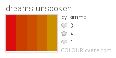
dreams_unspoken
Dreamcatcher
maybe_im_colorblind
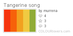
Tangerine_song
Tangerine_in_the_Sea
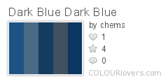
Dark_Blue_Dark_Blue
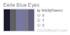
Eerie_Blue_Eyes
Vintage_Beach

0 comments Monday, October 20, 2008

Here is a list of the opening titles for Eternal Sunshine of the Spotless Mind:

FOCUS FEATURES presents

an ANONYMOUS CONTENT production

in association with THIS IS THAT

JIM CARREY

KATE WINSLET

KIRSTEN DUNST

ETERNAL SUNSHINE
OF THE SPOTLESS MIND

MARK RUFFALO

ELIJAH WOOD

and TOM WILKINSON

JANE ADAMS
DAVID CROSS

DEIRDRE O'CONNELL
DEBBON AYER

casting by
JEANNA MCCARTHY, CSA

associate producers
LINDA FIELDS HILL
MICHAEL A. JACKMAN

costume designer
MELISSA TOTH

music by
JON BRION

editor
VALDIS OSKARSDOTTIR

production designer
DAN LEIGH

directory of photography
ELLEN KURAS, ASC

executive producers
DAVID BUSHELL
CHARLIE KAUFMAN
GLENN WILLIAMSON
GEORGES BERMANN

produced by
STEVE GOLIN and ANTHONY BREGMAN

story by
CHARLIE KAUFMAN
& MICHEL GONDRY
& PIERRE BISMUTH

screenplay by
CHARLIE KAUFMAN

directed by
MICHEL GONDRY

0 comments

I went through the whole film and selected still frames that captured the tone, color, mood, narrative style, visual effects, and the visual effects from audio changes to help create a useful linear diagram to referrence assets for the animation creation:
Linear frame sequence

1 comments

Creative Brief

(click to download)

Project Details

Date: 10-18-08

Prepared by: Michael Broschart

Project name: Eternal Sunshine of the Spotless Mind Title Sequence

Design Lead: Michael Broschart

Hand-off to Production: 10/15/2008 Product Release: TBA

Project Concept

To develop a new title sequence that continues to follow the film’s narrative style while keeping the audience captivated and suspended until the film’s beginning.

Objectives

To bring something new to the original sequence from found imagery, type, video and sound. To discover and portray the filmmaker’s intentions while setting up the expectations for the audience. Thinking of the title as your only symbol to sum up the tone, look-and-feel, atmosphere and set the stage for the character(s).

Audience

The original filmmaker’s intended audience and our Art 328 class.

Perception/Tone

The overall perception is that of a dark yet comedic romance set to portray an average middle class Joe falling in love with an unexpected choice. The movie uses humor and snide interactions to build the relationship. Colors remain dark and muted except when portraying the new fascination. Then bright colors are used in moderation.

Communication Strategy

Carefully document the filmmaker’s color choices, tone shifts, transition styles, narrative word choice, and audio effects to compile a list of necessary elements that make the film what it is. Using the previous title sequence as a foundation I will push the sequence farther by enriching fleeting moments and emphasizing the erasure of memory.

Competitive Landscape

Similar movie titles:

2006 Amour-Legende

2006 Wristcutters: A Love Story

2006 Stranger Than Fiction

2005 Fetching Cody

2004 I Heart Huckabees

2002 Punch-Drunk Love

2001 Vanilla Sky

1999 Purgatory

1999 Me Myself I

1998 Sliding Doors

1997 Deconstructing Harry

1997 Open Your Eyes

1996 Schizopolis

1993 Groundhog Day

1991 Defending Your Life

1990 Joe Versus the Volcano

1981 Modern Romance

1980 Stardust Memories

1977 Annie Hall

1970 Alex in Wonderland

1967 Je t'aime, Je t'aime

Single-Minded Message

Inner struggle


Font Choices

Averoigne


Berry's Hand


Gumbootcha


ITC Machine


Neutra

0 comments Wednesday, October 15, 2008

I found this thorough review and technical critique of Eternal Sunshine of the spotless mind which aids very well in summarizing most of the characteristics I also found in the movie:
Dorian's critique

Here's another article that has a totally different feeling about the movie:
Snarkmarket
I felt this particular review really dove in quickly looking for a director to produce something even more compelling with a different actor. I loved the film and it's too bad this particular person couldn't enjoy it as well as I did.

This next read feels a little more unbiased than the previous two and one quote already stands out from the article as it applies to our project,

"By the opening credits, it’s apparent that this movie is investigating something deeper than a simple love story, but the viewer has no clue what, and still isn’t sure by the end of the film."
RF Critique
*edit: sorry I didn't realize this particular article was Christian biased.

Dennis C. Schweitzer's thesis from The College of Fine Arts of Ohio University on TON & TRAUM: A CRITICAL ANALYSIS OF THE USE OF SOUND EFFECTS AND MUSIC IN CONTEMPORARY NARRATIVE FILM' touches on how sound effects help create the amazing way of not knowing if you are viewing the character's reality or memory.
Eternal Sunshine of the Spotless Mind is quite remarkable for there is literally no way to distinguish between Jim Carrey's real life and his dreams on neither the sonic nor the visual level. What the audience sees on the screen is mostly the perspective of Jim Carrey's character as he is in his mind, which makes the film's reality the product of Carrey's memory. In other words, the audience perceives the film in the way Carrey's character saw and heard what we see now, which explains the film's particular look and sound. Eternal Sunshine of the Spotless Mind might thus be the truest form of depicting a character's life hence it depicts the world of its protagonist in the way he himself perceives it.
PDF of thesis

Yet another interesting read I found linked off the official site of a USAToday interview with Charlie Kauffman:Read it!

Found this guy's typographic voice book of the movie on youtube: Video

Here's a students project re-doing the opening credits: Video

0 comments Tuesday, October 14, 2008

All of Corvallis is without Eternal Sunshine of the Spotless Mind and none of my friends who are up have a copy legal or not. Quite pathetic. Even if I was to download it, that would take 8hrs for a 1.3gb file @ 20kbps on torrent. Should have set up a group viewing if you rented it from one of the local shops.

**Update: I was able to secure a copy**

0 comments

This 3rd animation uses a recognizable image of an orchid in a pot along with the content limitation of only using a plant:
train_referential

It took me quite a while to figure out what kind of recognizable image I was going to use. At first I was thinking of a worm but then I thought about how hard it would be to make it meander in a curvilinear fashion. The very next thing I thought of was a flower growing and breaking which lead me to the very nice potted orchid.

This animation almost built itself. As soon as I clipped the flower and pot from the background in Photoshop and assembled the layers on the stage I instantly saw how the flower would interact with the sound. It became a very fluid mechanical process that was a lot easier than the previous animation (Thank God!).

I went through the sound clip a few times to decipher all the sounds and I noted at one point it sounds like a second car squeak comes in. I also noted the steam venting happens twice and trails off each time. So I started with animating the first plant growing out of its pot in sync with the train squeak. I instantly tested movie and got a laugh out of the train squeak noise now relating to flower growth.

From there I continued to match up the different types of car squeaks. I listened carefully for the sound to see if it sounded like a quick directional break or a simple up and down motion. As you will see I applied the quick 2-part squeak to the flower breaking and the 1-part squeak to either the bottom half moving up/down or the top part re-aligning itself. I began to see the sound define the structure of my animation and within an hour I had the animation complete. But not without adding the background changes for the steam venting sounds.

I found all 3 animations I did to be quite successful under the limitations chosen.

0 comments

The following animation uses only one font with the other limitation being a restraint to two colors:
kids meeting with coach before game
**Needs to be run in a small window! If you run it larger than 550 x 400 it will go extremely slow**

Before I started animating I recalled from our first small group session that Chris suggested I try playing the sound clip backwards so that the words are not recognizable. I agreed that this would help relieve any continuity between animation and interpretation from hearing English words. So I went ahead and reversed the clip which worked out in the end to my advantage.

After getting about 2 seconds into this animation I realized I picked a sound that had way too many major and minor sounds to keep track of. But I chose not to back down from the challenge. The other challenge was trying to think of letters and letter combinations that I could use which would not represent humans too literally. For font choice I chose one that looked handwritten called TaylorsHand. This particular font had specific qualities that I felt mimicked the human voice in a subtle way. The edges were not sharp but organic and the proportions had good variation.

When first beginning the animation I tried to instantly start separating the sounds to letters. After an hour or two it became too aggrivating so I left the computer and went for a walk to 7-11. On my walk I tried to think of the other parts of the animation that needed attention so I could let my mind cool off from the tedious task of separating out all the kid chatter. On my way home I came to the conclusion to use two letterforms for the coach since he stood out and to make him a different color. I also thought of making smaller movie clip animations of letters jostling about to act as the background chatter; then to add irregularity to some. When I got back infront of my computer I went straight to working on the background chatter as it seemed easier to get started with.

Indeed it was easier and I had it done much sooner than I thought. I previewed the animation with two background movie clips and realized I needed more movie clips in the background to make it feel like you are surrounded at a soccer game by about 20 or so people. I went a lil overboard on syncing and duplicating which resulted in a very slow-running animation. So I pulled out the background movie clips until it ran better but still not full frame rate. I forgot to mention I added a blur effect and faded out these clips to reinforce the background quality. I believe the filter might have been causing the slower frame rate. Basically after some fine tuning I had the perfect set of background movie clips.

Next I got back to picking out the voices that stood out during the animation. There were 3 kids, grass crunching, the coach, random voice beeps and a mom sound. I picked a letter or symbol for each sound except the coach had a combination of two letterforms since his voice stood out the most. I then proceeded to follow the voices down the timeline and accent each outstanding voice with a variety of animation styles. I made the letterforms/symbols move directionally up and down and side to side depending on how the voice trailed in or out. Then depending on how loud or soft the voice was I adjusted the size over time. The only time I did not stick to this animating rule was when the odd grass crunching sound came in. To abstractly portray that grass sound I used a mask on some tilde symbols and revealed small bits in sync with the crunching. If there was a group of kids from the background shouting and coming into the foreground -- I took one of the background movie clips and brought it's alpha to 100% and animated it according to my previous animation rules.

During this animation process I tested my movie many many times to make sure I was still in sync and not killing the frame rate too bad. After a while I didn't have to test it as much since I knew from previous tests I was getting the sync correct.

On my last test I was truly amazed how well the irregular movieclips ended up matching up to voices both on purpose and by chance. It really was a work of art functioning on it's own. For the next animation I hope not to have as much tedious syncing.

0 comments Monday, October 13, 2008

Here's my abstract animation with the one media limitation being hand drawn. Even though it's all vector I used my Wacom tablet to draw the assets:
abstract_animation

The initial concept was to remove the referential sounds of the wood fire burning into a completely different image. At first I was thinking of using found objects and still photographs of a pencils rolling around and breaking whenever a crackle-pop from the fire was heard. After taking the photographs and thinking more on the concept I realized that it was still too literal. The pencil is wood and would make a similar sound when snapped. Therefore it might be too easy to understand the sound you are hearing. I wanted more of a challenge.

This drove me to instead, choose to digitally hand-draw shapes and lines. I thought about bowling balls rolling around for the rumbling noise the fire makes constantly so I drew some lopsided circles. They needed to be lopsided because the low rumbling fire burning sound was not a constant tone but slightly wavering. As these lopsided circles would roll, they give the look of an uneven sound much like the fire. The circles are also semi-transparent so that when they pass over/under each other they show a color interaction much like the rumbles you hear from the fire. I tried to have the circles animate across the stage at a pretty constant speed but at different times so you can relate to the constant hum yet unevenness of the rumbles.

Secondly I noticed there was one odd sound in my recording. This bell dropping sound. So in order to represent it I drew a circle that appears to go up then come down. As it comes down 2 more circles appear from it and all of them bounce off the ground and fade away. I chose this animation because the sound's pitch goes up and then down. On the downward part it has a few different tones; therefore multiple circles.

Lastly I animated different types of lines breaking to reference the crackles and pops. You'll notice in the beginning the first two lines reveal from a beginning point and at the end of the reveal they snap in half. I chose this method because the first two crackle sounds meander around before making the pop sound. All the rest of the popping sounds are quite instant and do not need a lead-in. You will also notice the first two lines are curvy which is trying to mimic the change in pace of the crackle before popping. All the other lines are sharp and vary in weight and size depending on how loud or close the popping sound appears.

All-in-all I am quite satisfied with my abstract interpretation of fire using only hand drawn shapes and allowing the referential sound determine the structure.

0 comments Monday, October 6, 2008

Well I watched atleast 10 random seconds of every video in the essential flash group and found that none of them provided anything new for me to learn except for the inverse rounded corner feature you can apply to the rectangle shapes.

0 comments

I chose the following 3 sounds from the previous 6:
1. Fire Crackling
2. Kids Playing Soccer
3. Train ride

You will find the in-class comments below the last image.

The following are my sketches and accompanying mindmaps of what I heard:


Comments from small group discussion:
Fire burning::
The forms illustrated were a good abstraction of the formal qualities. The crackling noise illustrations would be better represented if they appeared to come out of no-where. By have the forms evenly spaced out they do not relate to the variation of when the crackling noises occur

Kids playing soccer::
Try playing the soundclip in reverse so that you cannot understand the conversations and instead focus more on the formal qualities. There are interesting interactions between all the voices. Some of the child voices try to over power or push away the other sounds. This could be represented by shapes over powering or pushing others off the stage. There is a pretty clear definition of space between the group discussing the game and the background games going on. The background feels muffled and softer with a more constant tone vs the foreground sounds.

Train::
The metal sounds screeching are much louder and more piercing than they are illustrated. The sketches could benefit from a larger scale difference to showcase the aforementioned metal qualities. The 2nd and 3rd sketch do a good job of abstractly defining the metal screeching sound by using sharp lines that change direction in a perpendicular fashion.

1 comments Wednesday, October 1, 2008

You can view a copy of my film notes in PDF form here»

In summary I felt the film served 3 purposes:
1. To show the class a variety of ways of interaction and storytelling.
2. Make you think about the ways in which limitations can sculpt a project.
3. How the distance and pursuit of failure changes the expected outcome.

I came upon the trailer for this film on youtube and the trailer makes it appear the movie is much more dramatic and intense than I perceived it to be.
view the trailer»

0 comments

4. Cars passing in wet weather
5. Fire burning and crackling
6. People at concert screaming

2 comments Monday, September 29, 2008

Poking around on freesounds.org I stumbled upon these three that I thought had interesting formal qualities to produce a good animation:
1. swing swinging
2. kids at a soccer game
3. train sounds